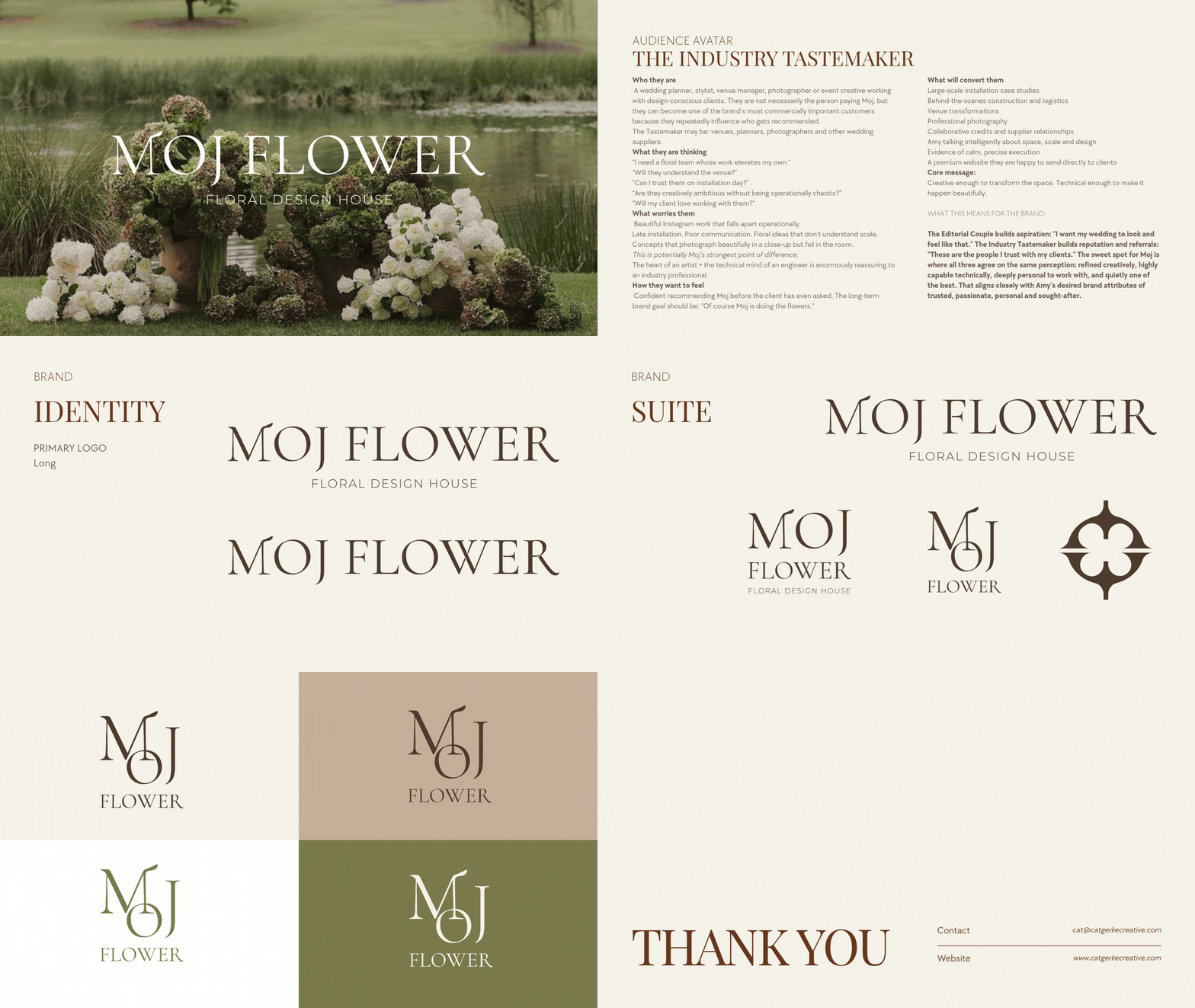
BRAND IDENTITY PACKAGE
MOJ FLOWER
From the outset, I interpreted the Moj Flower brief as an opportunity to create a brand that feels elevated and romantic, but not predictable within an already saturated wedding and floral market. Amy’s engineering background became a key point of difference, the ability to see structure, proportion, scale and execution through a technical lens, while still approaching the work with softness, emotion and artistry. The identity needed to hold both of those ideas at once. The custom wordmark does this through a refined, thin serif that brings structure and sophistication, paired with more organic letter endings that introduce movement, irregularity and a subtle hand-shaped quality. They are not intended to feel literal or overly floral, but to create just enough tension and personality to make the brand feel distinctive, dynamic and recognisably Moj Flower.