BRAND FOUNDATIONS PACKAGE
SANCTUARY KITCHENS
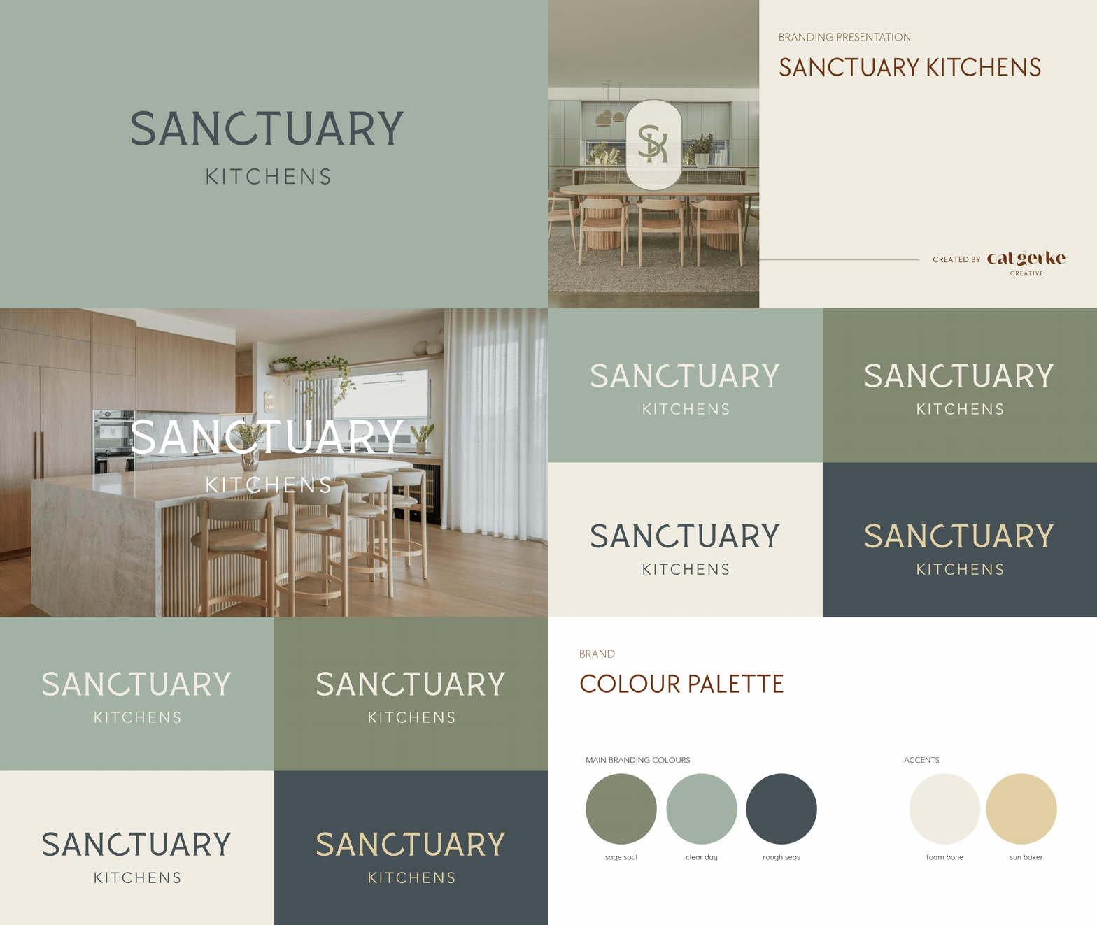
I interpreted the Sanctuary Kitchens brand as an opportunity to evolve the brand beyond the more generic, approachable cues of the existing identity and create something that better reflects the quality of the work being produced now. The new direction needed to feel elevated, calm and design-led, with a quiet confidence that would appeal to homeowners, interior designers and architects seeking a more considered level of custom joinery. The idea of “sanctuary” informed the sense of tranquillity within the palette, but it was important that the brand did not lean too coastal, tropical or feminine. Instead, the colours are slightly greyed and grounded, creating a sophisticated, masculine feel that is warm without becoming soft.
The result is bold without being loud, refined without feeling precious, and unmistakably Sanctuary Kitchens.