

Your Brand Isn’t For You: How to Build a Brand That Attracts the Right Customers
There is a slightly uncomfortable conversation that comes up in branding projects more often than you might think, and it usually starts with something seemingly harmless like colour.
A client loves a particular blue. Or they’ve always used a certain shade of green. Maybe they have been staring at the same logo for eight years and, despite knowing they need a rebrand, there are parts of it they simply cannot imagine letting go of.
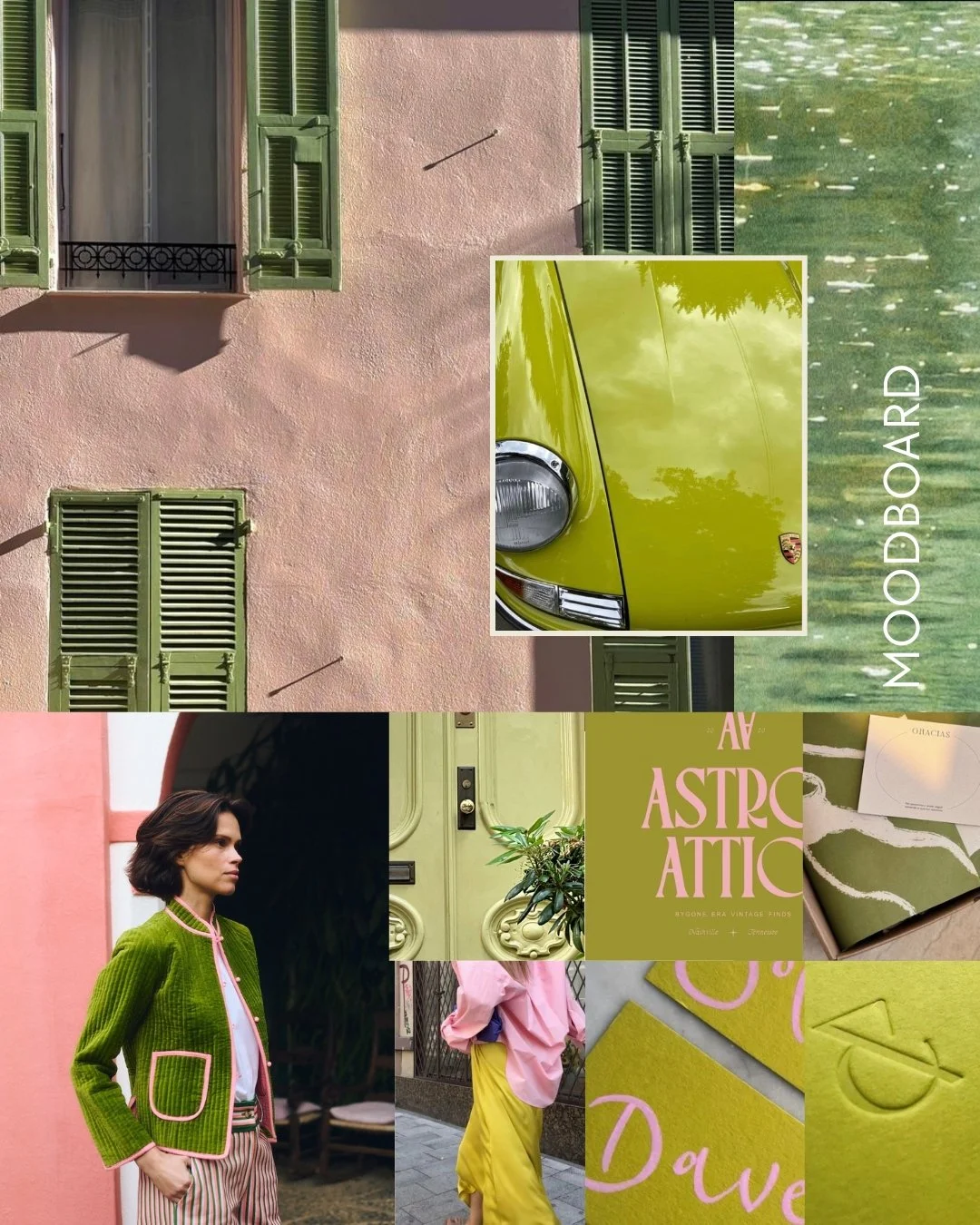
Branding Concept by Cat Gerke Creative
I get it. Completely.
I run my own business, and I’m also in business with a designer who is absolutely mad about colour and gets bored with almost everything in approximately two seconds flat. So believe me when I say I understand how personal visual decisions can become. I’ve had plenty of conversations that begin with, “But I really love this colour,” and occasionally I’m the one having them.
That’s exactly why colour, typography and branding in general can become such a sticking point for business owners. Your business is personal. You’ve built it, grown it, made hundreds of decisions around it and probably spent more time thinking about it than anyone else ever will. Of course you’re emotionally connected to how it looks.
The problem is that your customer isn’t. They are seeing it for the first time. And that is where brand strategy has to enter the conversation.
Your favourite colour can absolutely be in your brand but that can’t be the only reason it’s there.
One of the things I say to clients is that there is nothing wrong with loving a colour. Your brand should still feel like you. I don’t want to remove every bit of personality from a business and replace it with a tasteful cream background and an expensive-looking serif font just because somebody decided that’s what “premium” currently looks like.
But when I’m developing a brand identity, I’m asking a different set of questions alongside personal preference.
Who are we trying to attract? What do we want them to think when they encounter this business? How established should it feel? How accessible? How premium? How creative? What are we selling, at what price point, and what does the customer need to feel before they are willing to buy?
Suddenly the conversation isn’t really about whether we like blue.
It’s about what that blue is doing.
I recently had exactly this conversation with a client who had a strong attachment to an existing aqua-teal colour. There was nothing inherently wrong with it. It was bright, recognisable and had some history within the business. But the business itself had evolved. The service was more sophisticated, the customer she wanted to attract had changed, and the wider brand needed to feel more elevated.
My concern wasn’t, “I don’t like aqua.”
It was that this particular aqua was communicating something slightly more youthful, casual and accessible than the business actually was.
So rather than abandoning the colour altogether, the challenge became finding a version of it that retained the energy she loved while shifting the overall perception of the brand.
That is a very different branding conversation from simply choosing colours that look nice together.
Old logo
Sometimes your business grows up before your branding does.
This is probably one of the most common reasons people come to me for a brand refresh or rebrand.
When you start a business, you make decisions with the resources, knowledge and confidence you have at the time. Maybe you built the first website yourself. Maybe a friend made the logo. Maybe you chose a font because you liked it and picked three colours from Pinterest because they looked good together.

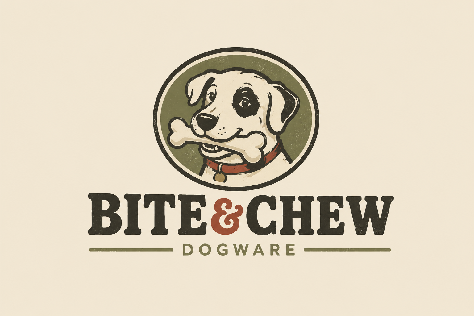
Re-brand of Bite+Che by Cat Gerke Creative… the brand grew up but didn’t lose the fun!
That is completely normal.
The goal in those early days is often just to get the thing into the world.
Then you start actually running the business.
You work with customers. You figure out which services are profitable and which ones you never want to provide again. Your experience increases, your pricing changes, you become clearer about the kind of work you want and the kind of client you want to do it for.
Five years later, the business may be almost unrecognisable from the one you originally branded.
But the website still looks exactly the same.
That is where a disconnect starts to appear.
Internally, you know you’ve become more experienced, more specialised and more valuable. Your existing customers probably know it too. New customers don’t have that history.
They have your website, your Instagram, your photography, your words and your brand identity.
That’s it.
And they are making decisions from those things much faster than most of us would probably like to admit.
People experience your brand before they understand your business.
We would all love to believe that somebody lands on our website and carefully reads every beautifully crafted paragraph before deciding what they think of us.
They don’t.
They scan.
They look at the imagery. They notice the colour. They absorb the typography, even if they couldn’t tell you what font it is. They register whether everything feels considered or chaotic, expensive or accessible, established or new.
Then, if we’ve done our job properly, they start reading.
That means the visual identity is doing a huge amount of communication before your copy gets the chance.
This is particularly important for service-based businesses because what you’re selling is often intangible. A potential client cannot pick up your expertise and inspect it before buying. They are looking for signals that tell them whether they can trust you, whether you understand their world and whether the value of the service makes sense.
Your branding is one of those signals.
Does your brand look like what you charge?
This is one of my favourite exercises because it strips away a lot of the emotion.
Pretend you know absolutely nothing about your own business. Forget what you charge.
Now look at your website, your Instagram, your proposal documents, your logo, your photography and your overall presentation.
What would you expect this business to cost?
It is a surprisingly useful question.
If your service is $5,000 but the presentation is communicating $500, your customer is going to experience friction when they reach the price. They aren’t going to sit there thinking, “There seems to be a disparity between the company’s pricing architecture and its perceived brand value.”
They’re just going to think, “That seems expensive.”
Equally, if you have intentionally built an accessible product or service but the brand looks so exclusive that people assume they cannot afford you, you have another problem.
Strategic brand identity design is about reducing that disconnect.
The branding should prepare somebody for the business they are about to experience.

Premium branding does not mean making everything beige.
I feel quite strongly about this one…
There has been a period where a certain kind of premium branding became almost formulaic. Neutral colour palette, lots of whitespace, fine serif typeface, perhaps a slightly obscure French word somewhere for good measure.
And look, I love beautiful neutral branding when it is right for the business. But “premium” isn’t an aesthetic.
A brand can be wildly colourful and still feel incredibly elevated. It can be playful, expressive, bold, hand-drawn, textural or strange. In fact, for some businesses, removing those qualities in an attempt to appear more sophisticated is exactly what makes the brand forgettable. What creates perceived value is usually much less about whether a brand is beige and much more about whether it feels intentional.
Does the typography make sense? Does the imagery feel considered? Are the colours being used consistently? Does the website have breathing room? Does everything feel as though it belongs to the same business?
You can absolutely use a bright blue. Just make sure it is the right bright blue.
Premium branding does not mean making everything beige.

Your brand needs to work for your customer without losing you in the process.
This is where I think “your brand isn’t for you” can easily be misunderstood. I’m not suggesting that business owners should disappear completely from their brands and build everything around what some imaginary target customer might like.
Especially in founder-led businesses, the person behind the business can be one of the biggest assets you have.
Your taste matters. Your story matters. Your personality matters. Your experience matters.
The goal is to find the point where who you genuinely are and what your ideal customer needs to see overlap. That is the sweet spot.
A good brand should still feel recognisably yours, but it should also make sense commercially. It should help the right person understand you faster. It should communicate the quality of what you do and position the business where you want it to sit.
It is not a costume you put on to appeal to customers. But equally, it isn’t your personal Pinterest board with a logo attached.
Before you change anything, work out what problem you are actually trying to solve.
If you’re considering a rebrand, I wouldn’t start by searching for logo inspiration.
I’d start by thinking about the customer you want more of.
What do they value? Why do they choose one business over another? What makes them trust somebody? What are they willing to pay more for? What do you want them to feel when they discover you?
Then look at your current brand and ask whether it is helping.
Maybe you want to attract larger clients but the business still feels very small and DIY. Perhaps your prices have increased significantly but the visual identity hasn’t evolved with them. Maybe your branding is highly polished, but so generic that nobody remembers it. Or maybe there is actually plenty that still works and you only need to refine a few elements rather than throwing the whole thing away.
That last part is important.
I don’t believe every business that comes to me needs a complete rebrand. Sometimes there is significant value in what you already have. A recognisable colour, a good name, a logo people know, an existing reputation.
Good brand strategy also means knowing what not to change.
Sometimes the answer is a new identity.
Sometimes it’s a better website.
Sometimes it’s stronger photography, clearer messaging or simply applying the brand you already have with more consistency.
And yes, sometimes it really is just changing the blue.
The business you’re becoming deserves to be visible.
If your business has evolved, your branding needs to be given the opportunity to evolve with it.
Because one of the strangest things about running a business is that you experience every tiny step of its growth. You know exactly how far it has come.
Your next customer doesn’t.
They only know what you show them.
So if you’re doing better work, charging more, attracting a different customer or simply becoming much clearer about the business you want to build, take a look at what you’re putting into the world and ask one question:
Does this still represent us?
If the answer is no, you don’t necessarily need to burn the whole thing down.
But it might be time to make sure the outside of the business has caught up with what has been happening on the inside.
THINK YOUR BUSINESS HAS OUTGROWN ITS BRAND?
You don’t need to arrive knowing whether you need a complete rebrand, a brand refresh, a new website or simply some strategic changes.
That’s part of my job.
At Cat Gerke Creative, I work across brand strategy, brand identity, website design and marketing, looking at how all of those pieces connect and whether they are helping you attract the customer you actually want.
Tell me where the business is now. We’ll work out what it needs next.