

How to Build a Website for an Artist That Actually Sells Work
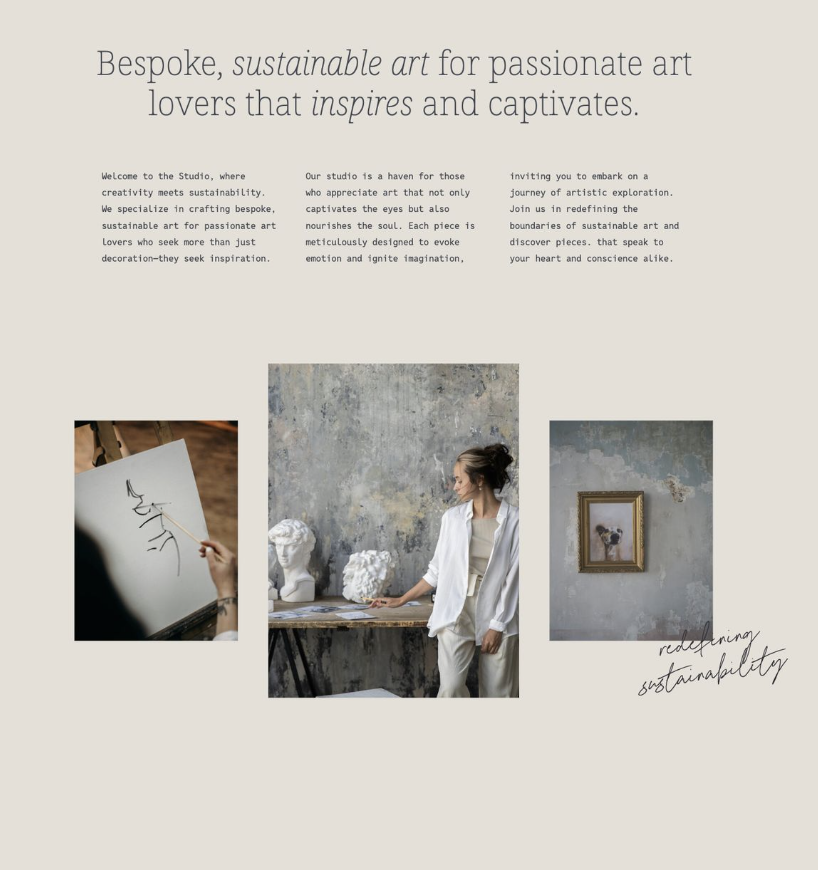
There is a strange thing that happens with artist websites. They can be absolutely beautiful, very tasteful, perfectly minimal… and almost completely useless at helping someone actually buy anything.
The work is there. The photography is lovely. There might even be a very elegant serif font involved. But after looking around for five minutes, I still don’t know what is available, what anything costs, how to buy it, whether you take commissions, whether the work is framed, whether you ship, or whether I need to send an awkward email that begins with, “Hi, just wondering…”
That is too much friction.
I say this as someone who has spent years working across branding, websites and marketing, but also as an artist myself. Artists are often very good at thinking about the integrity of the work and much less interested in thinking about conversion funnels, product structure or what happens after someone lands on the homepage.
Which I completely understand.
You made the painting. Surely that should be enough. Unfortunately, if you want your website to actually sell work, it needs to do a little more than function as a very beautiful digital catalogue. It has to help people discover the work, connect with it, trust you, understand what is available and feel comfortable enough to buy.
And that does not mean making your website feel commercial in a way that cheapens the art. It means making the buying process clear.
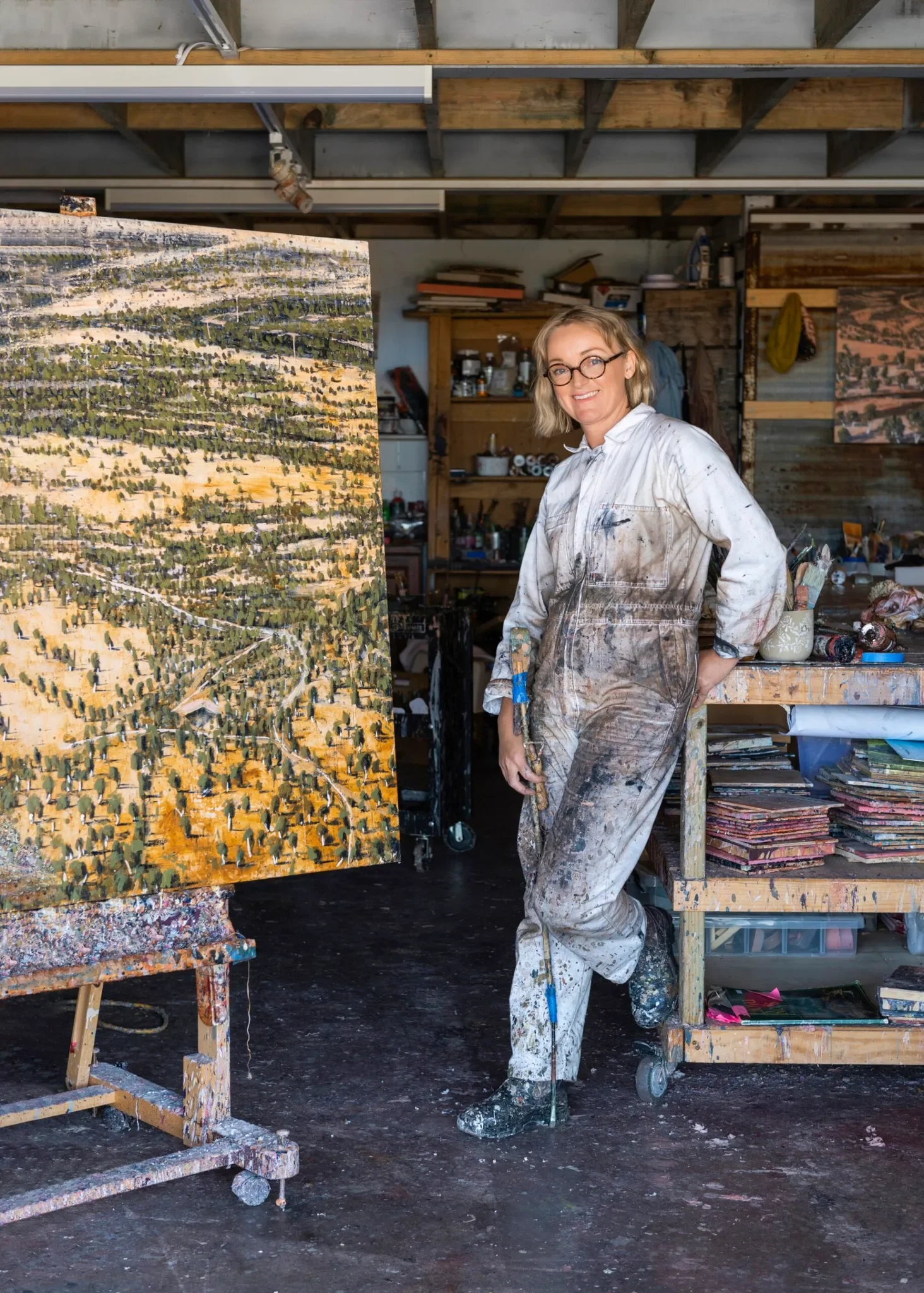
Painter Carly Le Cerf, who is based in WA, works on her piece titled Love is a River.
Your website needs to sell the artist as well as the artwork
People buy art for emotional reasons. Yes, they may care about scale, colour, price, framing and whether it fits above the sideboard. But they are also buying into the story of the artist, the meaning behind the work and the feeling they have when they connect with it.
This is where artist websites have a huge advantage over generic ecommerce. You are not selling a lamp.
You are selling something made by a person, with a point of view, a process, a story and a body of work behind it. Use that.
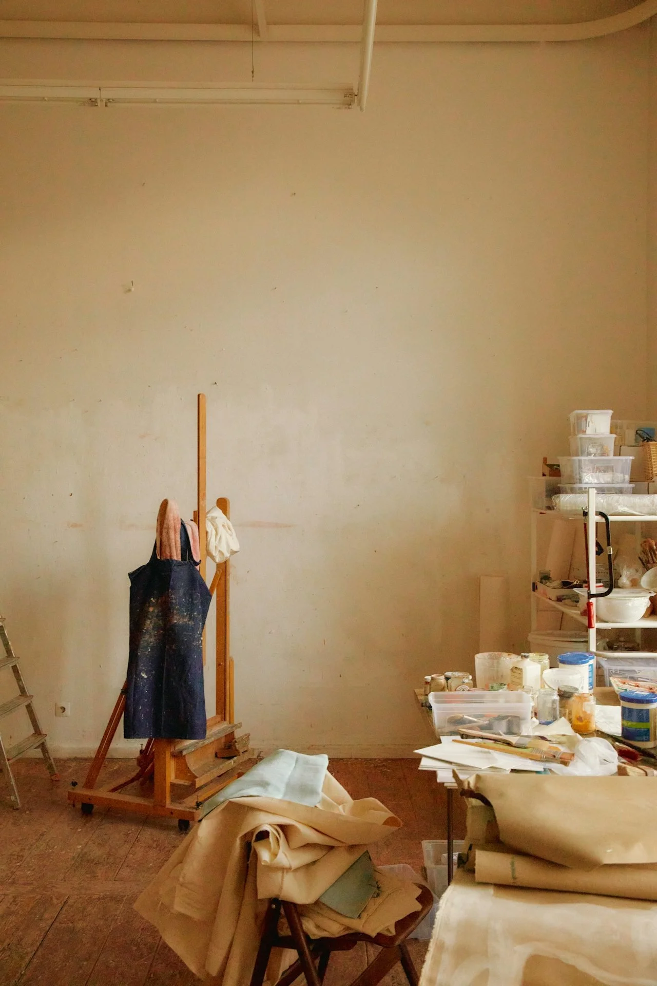
Your website should help someone understand who you are, what you make, what you are exploring and why the work exists. Not in a way that requires them to read a 4,000-word artist statement before they are allowed to look at the paintings, but enough to create connection.
A strong About page, concise artist statement and thoughtful project or collection descriptions can completely change how the work is perceived.
The artist is part of the value.
Stop hiding the work behind clever navigation
I see this particularly with creative websites where the desire to feel editorial or artistic starts getting in the way of usability. Menu items called Objects, Worlds, Archive, Practice, Editions, Field Notes and Things can all be very beautiful. They can also make absolutely no sense to the person trying to work out where the paintings are. Creativity in web design should never come at the expense of clarity.
If you sell original artwork, put Original Art in the menu.
If you sell prints, say Prints.
If commissions are available, say Commissions.
If the work is organised into collections, make those collections easy to navigate.
You can still make the site feel distinctive and beautifully branded. Your customer just shouldn’t need to solve a small conceptual puzzle before they can buy something.
Make it obvious what is actually available
This one sounds simple, but it is surprisingly common.
Someone sees a painting they love.
Is it sold? Available? Available through a gallery? Made to order? Part of an exhibition?
Nobody knows.
If the purpose of the website includes selling art, availability needs to be incredibly clear.
For each work, I would generally include the title, year, medium, dimensions, price or clear enquiry pathway, framing information where relevant, availability and shipping information.
If a work has sold, you can still show it. Sold work helps establish your body of work and gives collectors context around your practice. Just label it clearly.
There is nothing more frustrating than mentally rearranging your entire living room around a painting only to discover it sold in 2022.
Put the price on the website
There are exceptions, obviously, particularly where galleries are managing sales or you have a specific reason not to publish pricing. But for artists selling directly, I am generally in favour of showing the price.
Hiding it introduces uncertainty. People start wondering whether it is wildly outside their budget, whether they are expected to negotiate, whether they need to ask permission to find out, or whether they are going to embarrass themselves by enquiring.
A clear price makes buying feel normal. That is useful.
It also saves you from spending time responding to enquiries from people whose budget is nowhere near the work. You do not need to make purchasing art feel mysterious in order for it to feel valuable.
Give every artwork its own proper page
If you want people to buy individual works online, each one should ideally have its own page rather than living only in a giant gallery grid.
This gives you room to show more than one image, provide specifications, explain the work and include clear purchasing information.
Photograph the artwork front-on, but also show scale.
Put it in a room. Show the texture. Show the frame. Show a close crop.
If the surface is heavily layered, glossy, sculptural or textural, your photographs need to communicate that.
Buying art online involves a leap of faith because the customer cannot stand in front of it. Your job is to reduce that uncertainty as much as possible.
A beautifully styled interior image can also be incredibly useful because it helps someone immediately understand scale and imagine the piece in their own home. Just make sure the artwork itself still remains the hero.
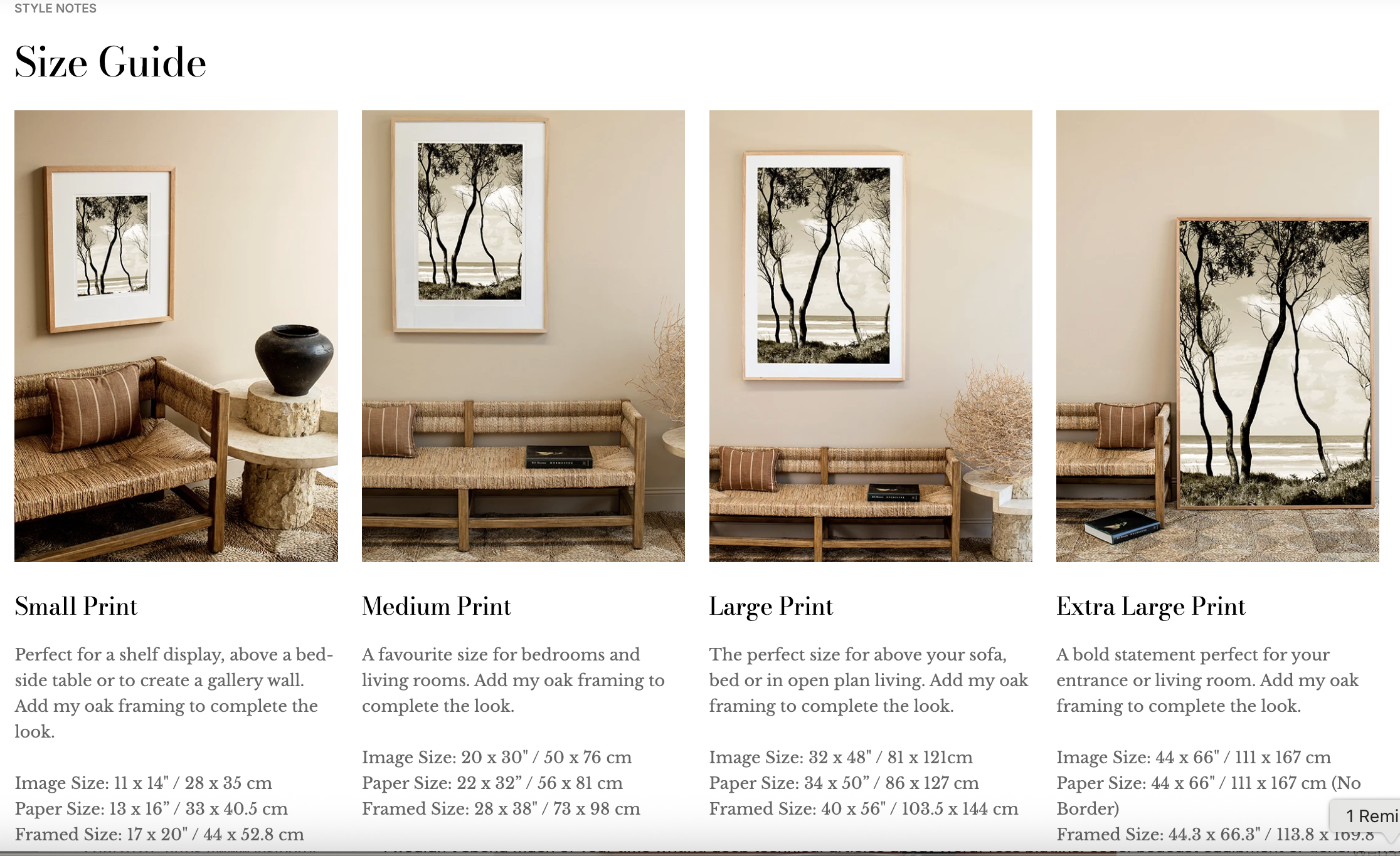
Kara Rosenlund makes it easy with all the sizing info and images showing scale in context, next to each other.
Scale is one of the biggest barriers to buying art online
A measurement like 1200 x 900mm means something to you because you work with those dimensions all the time.
To many customers it means approximately nothing.
They want to know:
Is that big? Will it fit over my sofa? Will it disappear on a large wall? Is it tiny?Show scale visually.
Include styled imagery, in-situ photography or a simple scale reference. If you offer different print sizes, showing them relative to common furniture can make selection much easier.
This is also where good website design matters. Your product page should answer the questions a customer would naturally ask if they were standing in a gallery with you. The goal is to make buying online feel less risky.
Tell people what they are looking at
Artists can sometimes be reluctant to describe work because they don’t want to dictate how someone should interpret it. Fair. You do not need to explain every emotion somebody is meant to have. But a little context can add enormous value.
What collection is it from?
What were you exploring?
What materials did you use?
Was the work inspired by a place, memory, landscape or idea?
Was there an unusual process involved?
A few thoughtful sentences can help people form a deeper connection with the work. That matters because buyers often want more than “Oil on canvas, 100 x 120cm.” They want a story they can carry with the artwork. They are going to look at it every day.
Give them something to connect with.
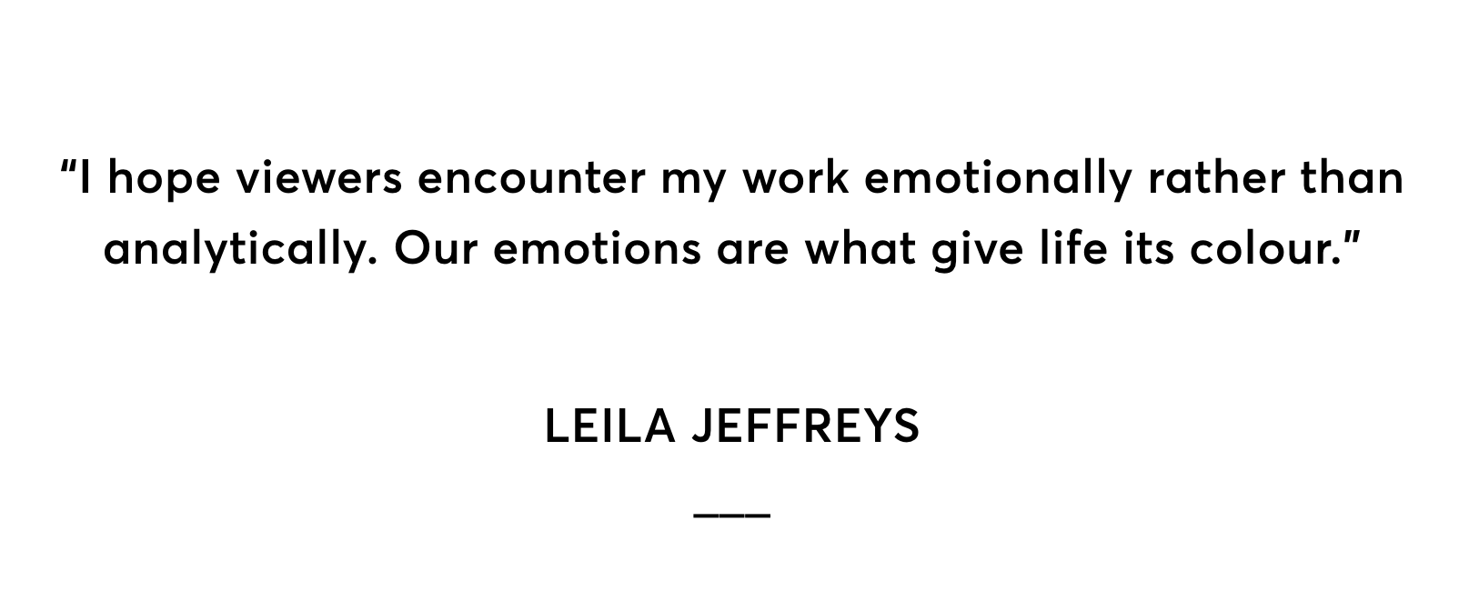
Artist statement by Leila Jeffreys
Your artist statement should not require a dictionary
There is a particular style of artist statement that appears to have been designed primarily to prevent anybody from understanding what the artist does. If your practice “interrogates the liminal tension between materiality and post-spatial identity through transgressive acts of visual semiotics”, that's wonderful. But perhaps also tell me that you paint landscapes.
You can absolutely retain intellectual depth. Just remember that your website may be visited by people who simply saw one of your paintings on Instagram and fell in love with it. They are not all reading from an academic arts background. Clarity does not make your work less sophisticated.
Create a proper About page
People want to know who made the work. Especially when they are investing in original art.
Your About page should include a strong photograph of you, your story, your practice, relevant exhibitions or achievements, where you are based and anything else that helps establish credibility and connection. This is not the place to upload a CV and leave. Your CV can absolutely live there as additional information, particularly if gallery representation, exhibitions, awards or collections are relevant.
But tell me something human too.
How did you get here?
What keeps pulling you back to the subject?
Why do you make the work you make?
Why should I remember your name?
The strongest personal brands do not separate the person from the work so aggressively that all personality disappears. For artists, that connection can be especially powerful.
Show the process
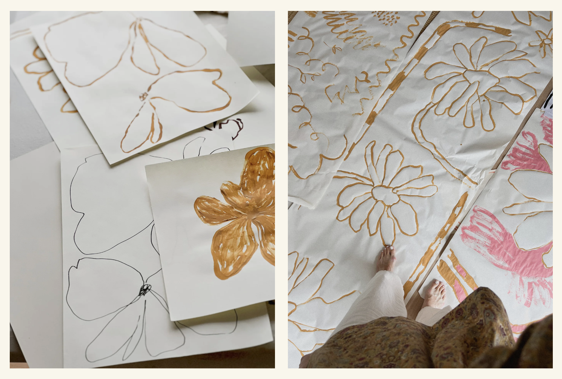
Artist Kimmy Hogan shows how her prints come together
One of the biggest missed opportunities I see in creative businesses is hiding all the work that happens before the finished product.
For artists, process is fascinating.
The studio. The materials. Sketches. Works in progress. Paint palettes. Canvases stacked against walls. The horrible middle stage of a painting where you become convinced you have ruined everything. The finished work arriving out of that process.
This content builds value because it reminds people that they are not buying a mass-produced decorative object. They are buying something created through skill, time, judgement and a very human process.
Use process imagery throughout the website, not just on Instagram. It can live on the About page, collection pages, journal, homepage and individual artwork pages.
It also gives you an enormous amount of material for content and email marketing.
Build an email list before you desperately need one
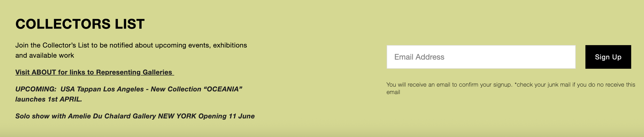
Amy Wright includes a ‘Collectors List’ on her website footer.
This is one of the biggest things I would tell any artist trying to sell work independently.
Your Instagram audience is useful.
Your email list is more valuable.
Instagram can show your work to people.
An email list gives you a direct way to tell collectors when new work is available.
If someone likes your work but is not ready to buy today, give them another option besides “follow me and hope the algorithm shows you my next exhibition”.
Create a simple invitation to join your mailing list.
You might offer early access to new collections, exhibition invitations, studio updates, new print releases or first access to original work. That gives people a reason to subscribe beyond receiving “news”. And then actually email them.
You do not need to become a weekly newsletter person if that makes you want to throw your laptop out the window. But when you have something meaningful to share, use the list.
Collectors cannot buy work they do not know exists.
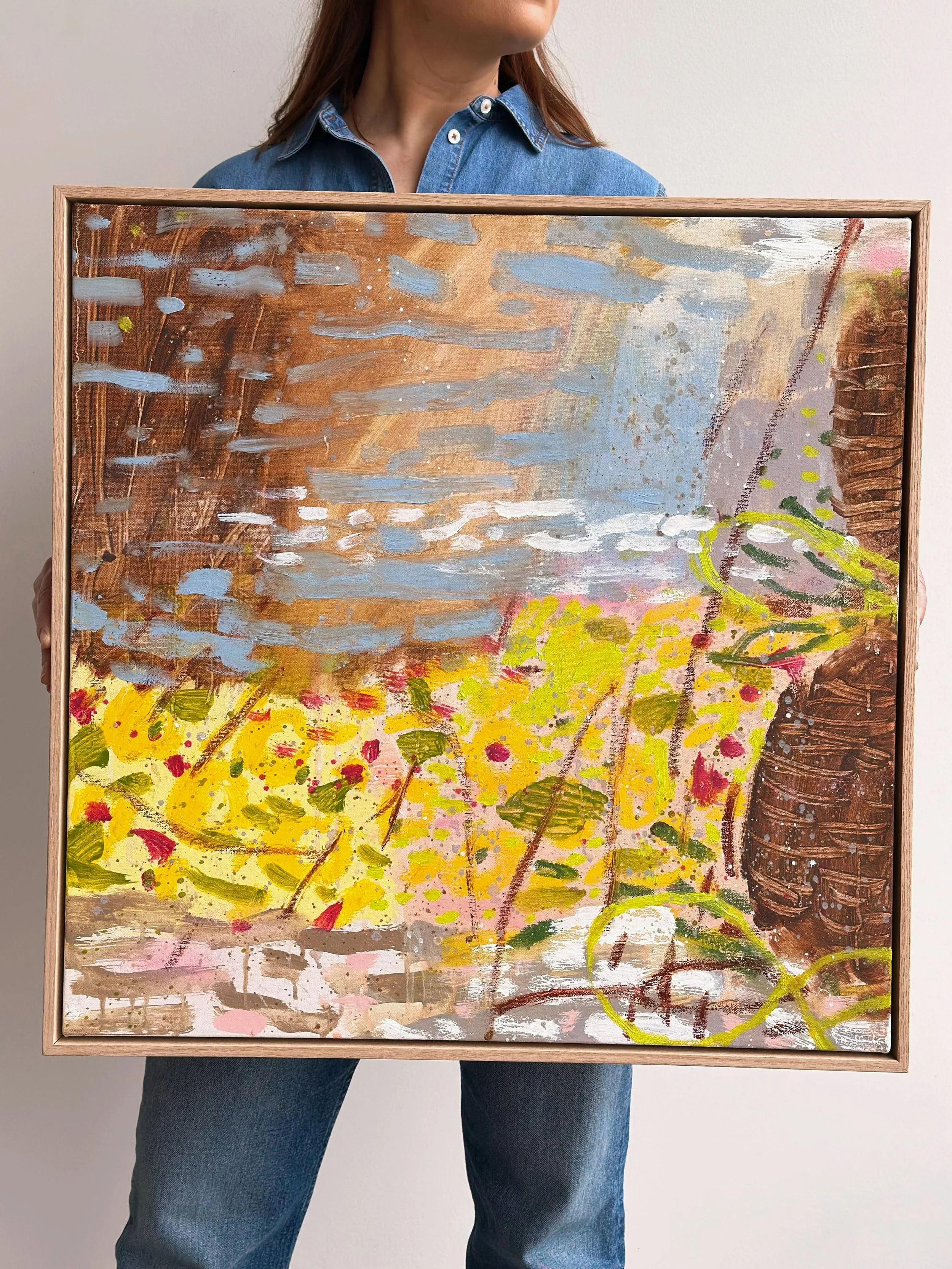
Original Artwork was created by Claudio Kirac for Jumbled
Consider giving subscribers first access to new work
This is one of my favourite strategies for artists because it creates value without discounting. Instead of putting a collection online and immediately telling everyone, give your mailing list a 24- or 48-hour preview. That makes being on the list genuinely useful.
It can also help create momentum around a release and reward the people who have already shown interest.
You are not trying to manufacture fake scarcity. The work is genuinely limited. There is one original painting. Once it is sold, it is sold.
That naturally makes early access meaningful.
Make commissions extremely clear
If you accept commissions, do not make someone hunt for evidence of this in the third paragraph of your About page.
Give commissions their own page.
Explain what you offer, what you do not offer, the kinds of commissions you take, approximate sizes, price guidance if possible, timeline, deposit requirements and how the process works.
Also show examples.
If you are not willing to paint somebody's Labrador wearing a crown, now is an excellent time to communicate that. You can say that commissions are created within your existing artistic language rather than recreating a customer's exact reference image.
The clearer you are upfront, the better the enquiries will be.
If you sell prints, make the choice easy
Prints can become strangely complicated.
Six sizes. Four paper stocks. Three frames. Two edge options. Rolled or stretched. Limited edition or open edition.
Suddenly somebody who simply loved the image is doing admin. Simplify wherever you can.
Explain the difference between options clearly and use photographs to demonstrate them.
If you sell limited editions, explain the edition size, whether they are signed and numbered and whether a certificate of authenticity is included.
If the print arrives unframed, say so. If it ships rolled, say so.
If the frame shown in the photograph is not included, definitely say so.
Nobody enjoys receiving a tube when they thought they had ordered a framed artwork.
Shipping information should not be a surprise at checkout
This is particularly important in Australia because geography is not exactly working in our favour.
If you sell original work nationally, explain how shipping works.
Is delivery included?
Calculated separately?
Do you use specialist art couriers?
Can people collect from your studio?
Do you ship internationally?
What happens with very large work?
Are there regional limitations?
You do not need to give an exact freight price for every original artwork if that is impractical, but the customer should understand the process before they commit.
For prints or smaller works, make shipping costs as straightforward as possible.
Unexpected freight is one of the easiest ways to lose someone at checkout.
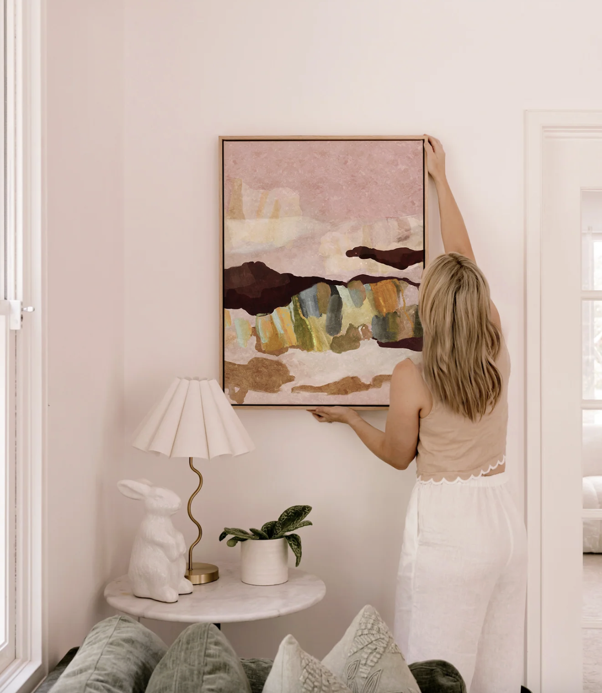
Corinne Melanie shows how her art can be styled in her imagery.
Your website needs trust signals too
Art may be emotional, but online purchasing still requires trust. Make sure the website clearly shows who you are and how to contact you. Include secure payment options, shipping and returns information, privacy information and proper terms where relevant.
If you have gallery representation, press features, awards, exhibitions, significant collections or testimonials from collectors, include them naturally. Not as a giant wall of “AS SEEN IN” logos if that doesn’t fit your brand, but enough to establish that there is a real artist and professional practice behind the screen.
If you have collectors happy to share a photograph of the work installed in their home, those images can be incredibly powerful too.
People love seeing where art ends up.
Do not make everything available at once just because you can
A large body of work can actually make buying harder. If your online shop contains 97 original pieces dating back eight years, it can start to feel more like an archive than a current collection.
Curate.
You may have a current collection, a small selection of available originals and an archive of sold work. That is very different from throwing everything onto one Shop page and asking the customer to sort it out.
Editing creates confidence. It also helps your current work feel intentional rather than like the leftovers from everything you have ever made.
Sold work is still valuable content
Do not delete every sold piece from the website.
Sold work helps establish your visual language, demonstrates demand and lets new collectors understand the wider practice.
Create an Archive or Past Work section if appropriate.
Just make the distinction between available and sold incredibly clear.
An archive is also useful when someone enquires about a commission.
They can say, “I loved the scale and colours in this piece,” which gives you a much better starting point than “Can you do something blue?”
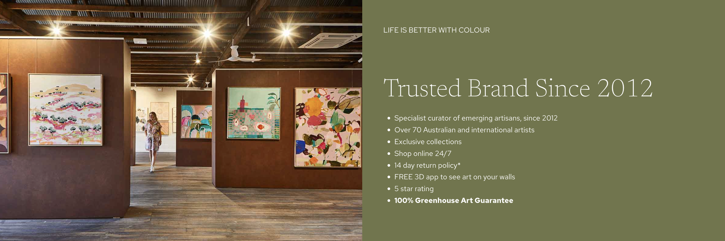
Greenhouse Interiors showing straight away on their homepage why you should buy from them.
Make the homepage do an actual job
Your homepage does not need to show everything. It needs to tell somebody very quickly:
Who are you?
What kind of work do you make?
What can they buy now?
What should they explore next?
A strong artist homepage might include a beautiful hero image, a short introduction to your practice, featured available work, the latest collection, a glimpse of the artist and process, perhaps recent press or exhibitions, and an invitation to join the mailing list.
Keep the journey clear. The homepage should create enough interest that somebody wants to move deeper into the site.
It does not need to contain your entire life story.
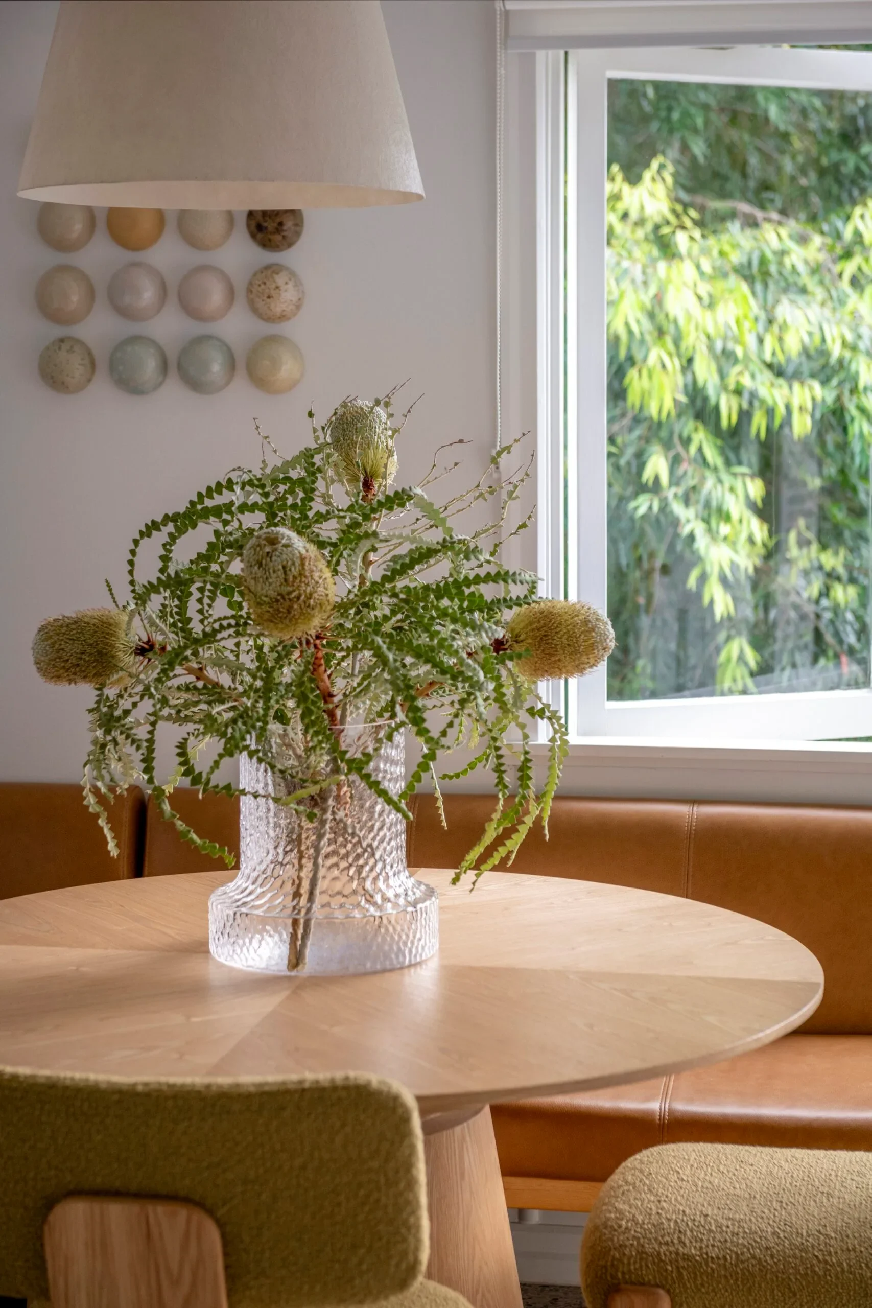
Interior designer Claire Stevens chose an artwork by Sam Mayell Ceramics for this clients home (Photography: Catherine Schusler)
Think about interior designers as customers too
This is especially relevant for Australian artists working in residential art.
Interior designers, stylists and architects can become incredibly valuable repeat buyers or referrers.
Make their job easy. Clearly list dimensions. Make high-resolution imagery available on request. Explain framing. Show works installed. Keep your availability current.
Respond professionally.
If you offer trade arrangements or can work directly with designers on commissions, say so.
A designer sourcing artwork for multiple projects may be much more valuable long-term than a single retail transaction.
And if an interior designer has used your work in a project, collaborate.
Share the photography.
Credit each other.
Create a case study.
Ask whether the project can be featured.
That kind of cross-promotion is one of the most useful forms of marketing available to creative businesses because both brands are speaking to overlapping audiences.
Your website needs to work on mobile
A very large portion of people will discover your art through Instagram and immediately click through on their phone.
Check what happens next.
Can they actually see the work? Are the titles readable? Can they find the price? Is the checkout easy? Are enormous images taking seven years to load? Does the menu work?
Is a giant newsletter pop-up covering the entire painting they were trying to look at? Desktop is important for artwork because people often want to see detail on a larger screen, but mobile discovery matters enormously.
Your website needs both.
SEO matters for artists too
Artists often assume everyone will arrive through Instagram or by already knowing their name. Some will. But people also search for things like Australian abstract artist, Byron Bay artist, original Australian art online, large contemporary paintings Australia, coastal artwork, original paintings Sydney or whatever is relevant to your work.
Your website should give Google enough information to understand what you do.
That means useful page titles, artwork descriptions, collection text, proper image alt text, an About page, location information where relevant and a website structure that isn't made entirely from unlabeled photographs. You do not need to write like a robot.
Please don't.
But if your entire homepage contains the words WORK / ABOUT / CONTACT, there isn't a great deal for search engines to go on.
Your art can remain the hero while your copy quietly does useful work in the background.
Create content around the things people want to know
You do not need to become a full-time blogger. But a handful of genuinely useful articles can help bring people into your website through search.
You might write about how to choose art for a home, how to choose the right scale for a wall, the difference between an original and a fine-art print, how to frame artwork, how you create a commission, what inspired a particular collection or how to care for an original painting. These articles demonstrate expertise while naturally bringing people into the world of your work. They also give you something far more useful to share on social media than “new blog post”.
The content can become Reels, carousels, emails and Pinterest posts too.
Again: one good idea, used properly.
Do not let the website become more important than making the art
This one comes from the artist side of me.
Your website matters.
Branding matters.
Photography matters.
Marketing matters.
All of it can help a creative practice grow.
But none of it compensates for not making the work. There is a very real danger in creative businesses of spending three weeks perfecting the font size on your About page because it feels much safer than making the next painting.
Ask me how I know.
Build a website that works.
Make it beautiful.
Make the buying process clear.
Create the systems you need.
Then get out of it and back into the studio.
The website exists to support the practice.
Not replace it.
So, what should an artist website actually include?
At a minimum, I would want to see a clear homepage, available original art, print or edition pages if relevant, individual artwork pages with dimensions and pricing, an About page, artist statement, commissions information if offered, an archive of sold work, shipping and purchasing information, contact details and an email sign-up. You might then add exhibitions, press, stockists or gallery representation, a journal, trade information for interior designers, testimonials, studio/process content or FAQs depending on your practice.
The exact structure will vary. The goal does not.
Your website should make it easy for somebody to go from:
I like this work
to:
I understand this artist
to:
I want this piece
to:
I know exactly how to buy it.
That is the journey.
A beautiful artist website is not enough
There is absolutely nothing wrong with wanting your website to feel beautiful. It should.
For an artist, the visual experience matters enormously. But good website design is not choosing between aesthetics and selling. It is creating a site where the two reinforce each other.
The branding should elevate the work. The photography should help people experience it. The copy should create connection. The structure should make discovery easy.
And the buying process should remove unnecessary hesitation.
Because if someone has already fallen in love with the painting, the website's job is not to impress them with how clever the navigation is. It is to make sure you don't accidentally talk them out of buying it.
NEED AN ARTIST WEBSITE THAT DOES MORE THAN LOOK BEAUTIFUL?
At Cat Gerke Creative, I work across branding, website design, content and marketing for creative and founder-led businesses, and my perspective on artist websites is particularly personal because I understand both sides of it.
The work has to remain the hero. But the business around the work still needs to function.
If you're an artist who has outgrown a DIY website, needs a clearer way to sell originals or wants your online presence to finally reflect the level of your practice, I can help you work out what needs to change.
LET'S BUILD A WEBSITE THAT MAKES THE ART EASIER TO BUY →